When I'm not making theatre I use my visual fantasy to create logos, brand identities, print and online media.
Like this webpage.
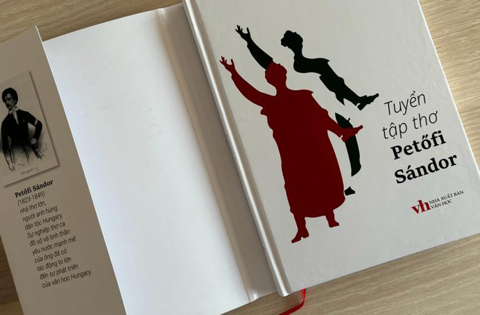
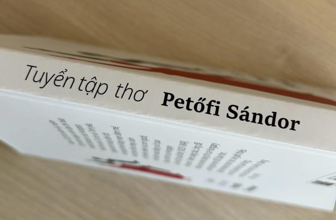
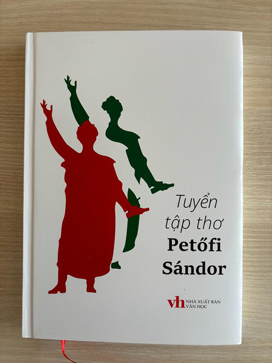
The new Vietnamese Petőfi book
Such things happen once in a generation: Hungarian poems published in Vietnamese.
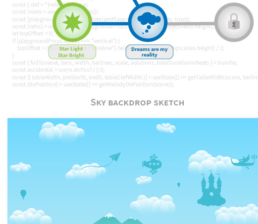
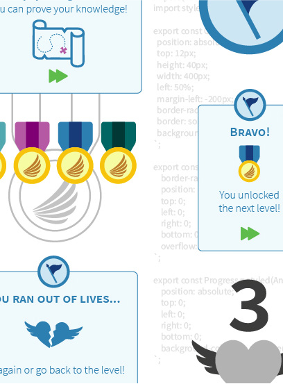
Adventures!
mobile application
An exciting challenge in cooperation with the Singaporean Kodály Academy of Music.
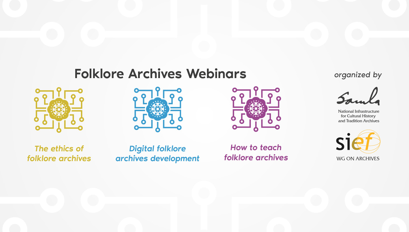
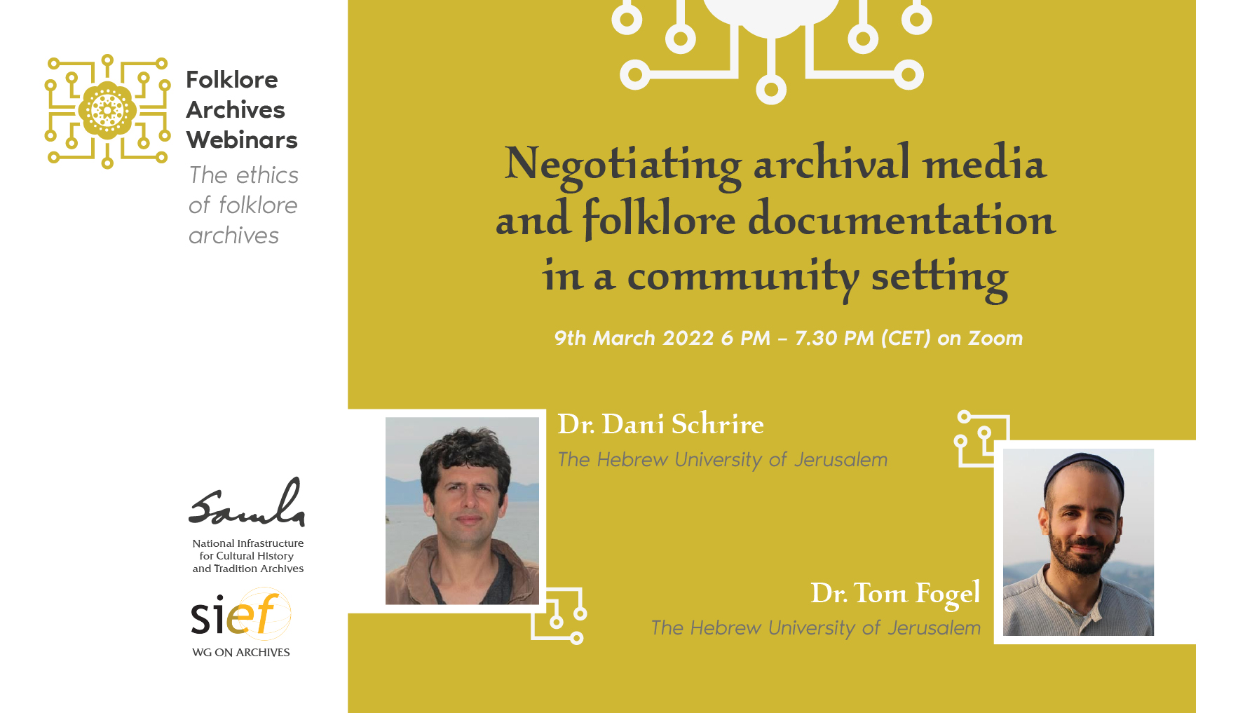
Folklore Archives Webinars logo and brand identity
Norwegian scholars told me: Be funky!
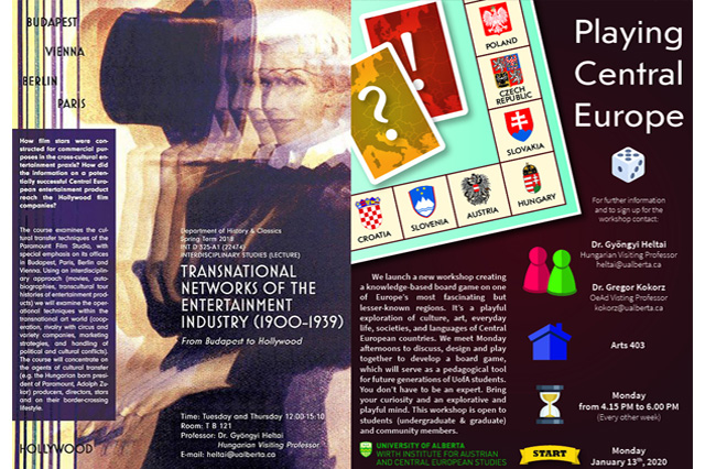
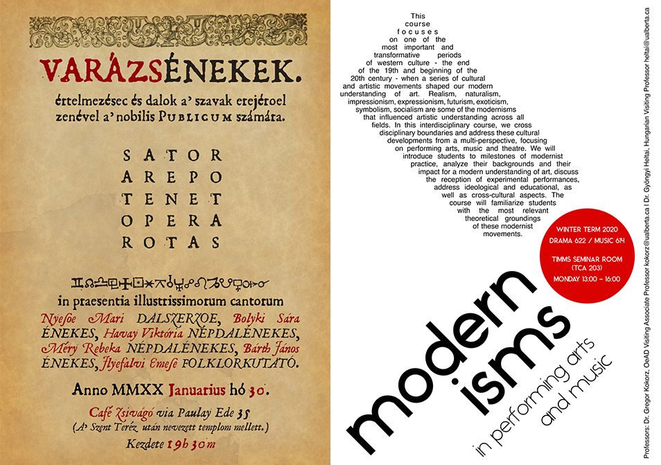
Poster design
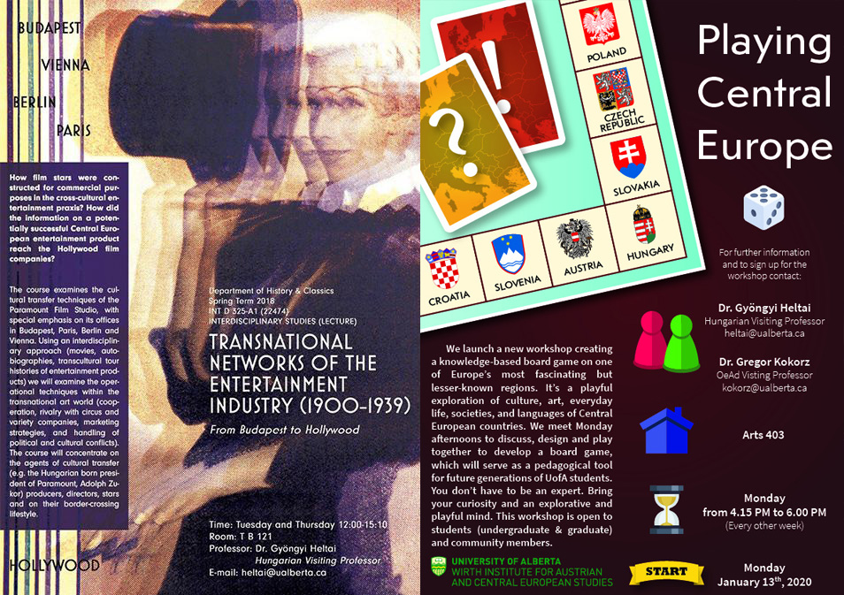
Canadian university professors turn to me when they want to attract more students for their lectures.
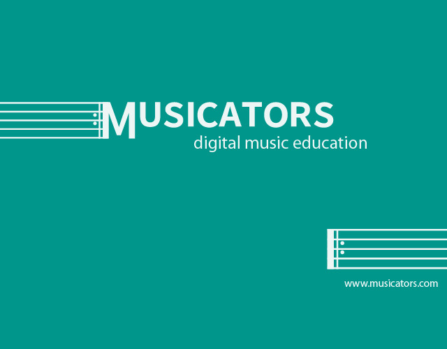
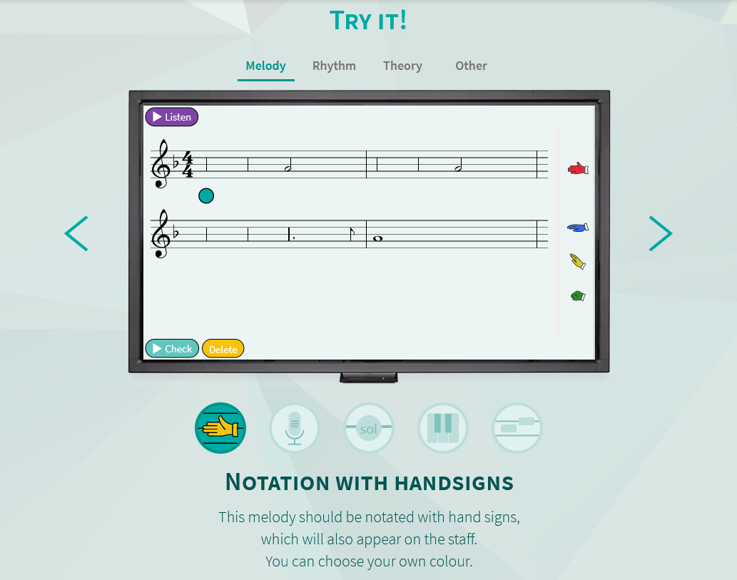
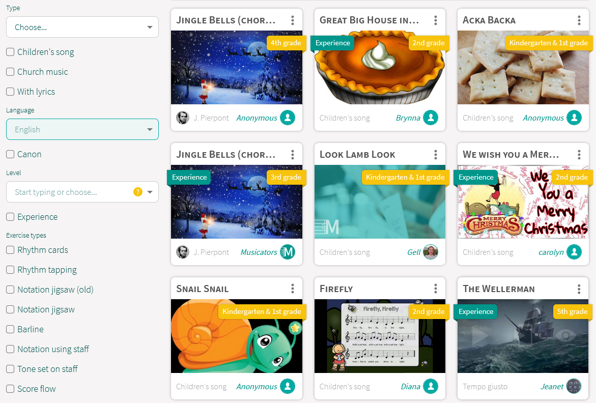
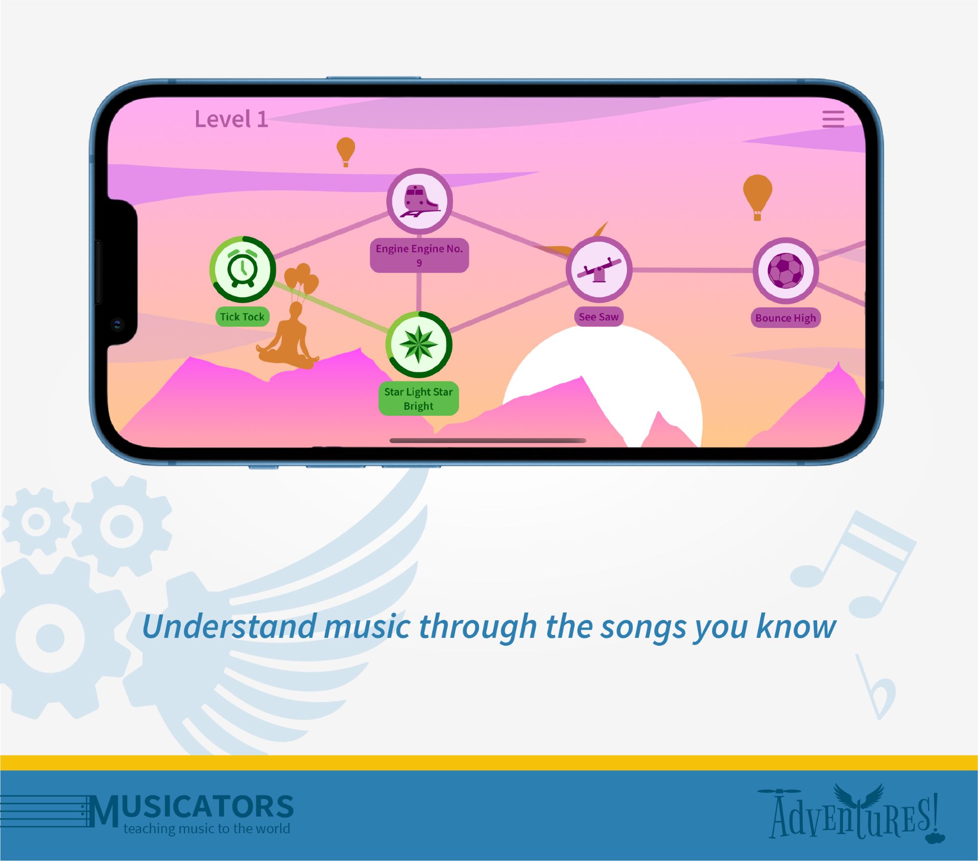
Musicators brand
Started as a pet project, now a phenomenon: a webapp helping music teachers worldwide.
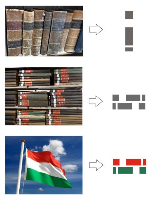
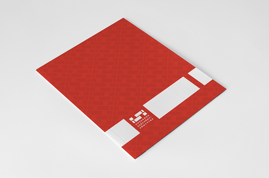
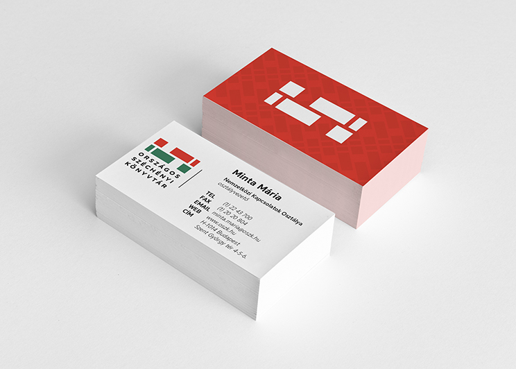
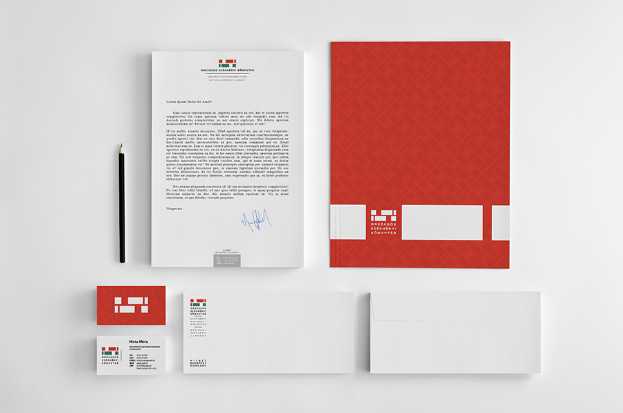
National Library logo
and brand identity
The National Széchényi Library of Hungary announced a logo contest to redefine their brand identity. I had an idea.